
Color and shape matching of tableware
2024-06-05
When designing tableware, the combination of color and shape is very important. They can complement and emphasize each other to create a more attractive and coordinated visual effect. Here are some common examples of color and shape combinations for your reference:
Simple shapes + bright colors:
If the shape of the tableware is relatively simple, such as round or square, you can choose a bright color combination, such as red, blue or yellow, to increase visual impact and vitality.
Curved shapes + soft colors:
If the shape of the tableware has a curve or streamline, such as a wave or arc, you can choose a soft color combination, such as light blue, pale pink or gray, to create a warm and comfortable atmosphere.
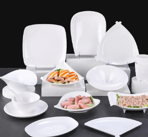
Irregular shapes + neutral colors:
If the shape of the tableware is irregular or artistic, such as a misaligned shape or a unique shape, you can choose a neutral color combination, such as white, black or gray, to highlight the uniqueness and artistry of the tableware.
Natural shapes + earthy tones:
If the shape of your dinnerware is inspired by natural elements, such as the shape of a flower or a leaf, choose an earth-toned color palette such as green, brown, or orange to create a natural and vibrant feel.
Keep in mind that the effect of pairings also depends on personal preference and the style of the overall dining environment. You can choose the best color and shape combination according to your preferred style and atmosphere. At the same time, if you have a specific color or shape preference, please let me know and I can provide you with more personalized suggestions and designs.


X
We use cookies to offer you a better browsing experience, analyze site traffic and personalize content. By using this site, you agree to our use of cookies.
Privacy Policy